TL;DR
Tilt-up construction has emerged as a highly efficient method for constructing buildings. It offers numerous advantages for constructors striving for sustainability, cost-effectiveness, and luxury.
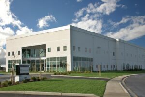
In essence, tilt-up construction involves casting concrete wall panels on-site and then tilting them into position once they have gained sufficient strength.
Tilt-up buildings are economical as they require less material, workers, and space. They also need less maintenance due to their durability and strength.
Furthermore, by insulating the panels, designers can reduce the building’s reliance on heating and cooling systems, thus saving energy.
Tilt-up building allows spaces to be used to their upper limit by allowing vertical expansion.
Lastly, tilt-up constructions prioritize safety by minimizing tasks performed at heights and emphasizing training initiatives.
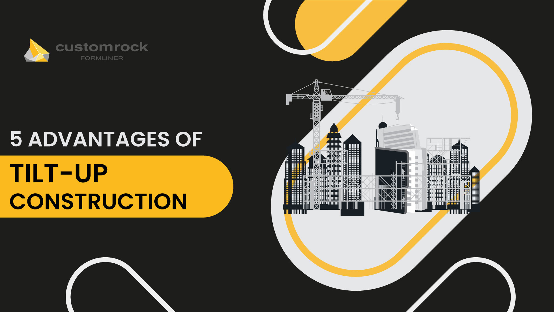
5 Advantages of Tilt-Up Construction
Constructors are always on their toes when designing buildings that are sustainable and cost-effective but, at the same time, luxurious.
With the arrival of tilt-up constructions, they can achieve this. What is the nature of tilt-up constructions and their significance? Why is it considered essential by many constructors?
Tilt-up construction is a method of constructing buildings where concrete wall panels are cast on-site. Once the concrete panels have gained sufficient strength, they are tilted into position with the help of cranes.
This method of construction is the talk of the town because it saves money, time, and the environment.
To know more, read this article and delve deeply into the world of tilt-up constructions and their advantages.
What Is Tilt-Up Construction?
Tilt-up construction is a method of construction where concrete wall panels are cast on-site.
Once the concrete panels have gained sufficient strength, they are tilted into position with the help of cranes. This type of construction is very efficient, and it allows for the building of 100,000 sqft to be completed in just 4 months.
Here are the steps involved in tilt-up construction:
- Prepare The Site: All the equipment is gathered on-site, and the concrete floor slab is poured. Next, wall footings are created around the slab.
- Build Concrete Wall Molds and Get Ready to Pour Concrete: The workers assemble the panel forms on top of the foundation slab. Next, the crew ties the steel grid of reinforcing bars into the form. They install inserts and embeds for lifting the panels and attaching them to the footing, the roof system, and each other.
- Pour Concrete, Tilt-Up Panels, and Install Insulation: The slab beneath the forms is then cleaned of any debris or standing water, and workers pour concrete into the forms to create the panels. At this point, insulation can be included in exterior walls by sandwiching it between layers of concrete.
- Raise Concrete Panels in Place: Once the concrete panels have solidified and the forms have been removed, the crew connects the first panel to a crane with cables that hook into the inserts. The crane lifts then the panel from the slab into a vertical position above the footings.
- Finishing: The roof is installed, and all the finishing work, like painting, staining, and sandblasting, is done. After this, all the interior work, such as plumbing and electricity, is done.
5 Advantages of Tilt-Up Construction
Here are the advantages of tilt-up construction:
-
Cost Effective
Tilt-up construction has various economic advantages. Firstly, the panels are made to precise dimensions by casting concrete directly on the site instead of cutting them elsewhere.
This reduces material waste and minimizes on-site overheads by eliminating the need for extensive material storage.
Two, this process is so efficient that a single worker can do many jobs, reducing the need for many workers.
A small group of employees is sufficient to put the concrete walls into place and lift them upwards so that the roof can be attached.
At the same time, you can use simple metal alloys or a high amount of steel to build the building.
Thus, builders can save money on material and staff by not hiring too many but at the same time paying fair wages to those hired temporarily.
Lastly, though initial costs differ, the long-term financial advantages usually outweigh any upfront investment. This makes them financially feasible in many cases.
-
Durability And Strength
Another advantage of tilt-up constructions is their durability and strength. Concrete panels are the foundation of tilt-up constructions. This material has properties that allow it to withstand severe weather conditions.
First of all, concrete has a very high density, i.e., 2.4 g/cm³. It is also highly malleable. This means that it can be bent into different shapes without cracking.
This property allows it to absorb some energy from seismic waves and prevent it from being transferred to the building.
These properties enable it to stand firm against earthquakes, thus ensuring the safety of occupants. Concrete also has a low permeability, which makes it resistant to liquids.
This property helps to protect the steel reinforcements inside the concrete from corrosion, which could weaken the structure over time.
-
Energy Saving
Due to the rise of global warming and the exhaustion of non-renewable energy resources, experts are trying to save energy and invest in renewable energy resources.
Tilt-up constructions can help with this with their various energy-efficient designs and methods. The first method is to insulate the panels.
Reliance on heating and cooling systems can be reduced by using insulated panels from materials such as polystyrene.
As a result, your energy bills will be lower, and residents will enjoy a warm home during the winter and a more relaxed place during the hot summer months.
Moreover, tilt-up construction offers flexibility in their designs. Due to this, we can easily integrate energy-efficient building systems, such as HVAC, lighting, and controls.
Lastly, as these buildings have a long life, we can reduce the environmental impact of frequent renovations or demolitions.
-
Space Saving
The fourth benefit of tilt-up construction is that it saves space. Builders who work in hustling, bustling cities find this particularly advantageous as unused land is sparse there.
With tilt-up construction, builders can easily make long skyscrapers.
The structural integrity of tilt-up buildings allows additional floors to be added without requiring extensive modifications to the existing structure.
Moreover, the construction process also requires limited space as tilt-up panels are cast directly at the construction site.
They are not stored; thus unlike traditional building methods, additional land space for storage is not needed.
Other activities, such as erection and finishing all take place within a relatively small footprint. This minimizes disruption to surrounding areas and maximizes the efficient use of available space.
-
Safety
Tilt-up construction prioritizes safety by minimizing tasks performed at heights.
In tilt-up construction, critical activities such as panel casting and finishing are done at ground level.
By doing these works on the ground, there is less reliance on heavy lifting equipment or manual handling of bulky materials.
This reduces the risk of musculoskeletal injuries and creates a safer working environment.
Lastly, through comprehensive training and awareness initiatives, construction companies ensure that all workers are equipped with the knowledge and tools to perform their tasks safely. This fosters a culture of safety on the construction site.
It is also easier to implement these safety rules as tilt-up construction has standardized procedures that are easy to understand.