TL;DR
The psychology of color in design is a powerful tool for creating emotional connections with audiences. Designers utilize color harmony, contrast, symbolism, and cultural associations to evoke certain feelings and responses.
They can also do this by combining color with light, sound, and motion to create a multisensory experience.
Colors like red signify passion and urgency. It is often used in marketing to grab the attention of viewers. Blue, on the other hand, instills trust and calmness. This is why it is common in professional settings and healthcare environments.
The color pink provides plenty of shades and with its soothing texture and contrasts, it can be useful for healthcare facilities and children’s products.
On the other hand, purple is often associated with royalty and spirituality which makes it a perfect fit for luxurious and romantic architectures.
By understanding the psychology of colors, architects can strategically employ them to enhance visual experiences and establish deeper emotional connections with their audience.
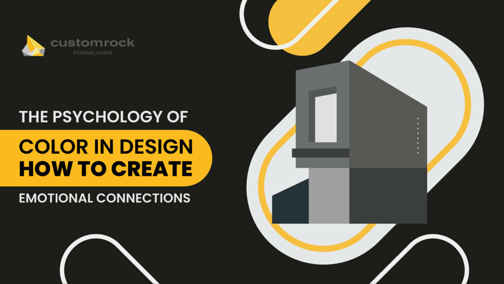
The Psychology of Color in Design: How to Create Emotional Connections
Color is not just a visual sensation. It is a language that influences our perception of the world. Different colors spark different emotional responses in a human.
Designers take advantage of this psychology to design spaces that provoke targeted responses and feelings.
This article will dive deeply into how different color combinations can alter human emotions. We will also discuss the psychology of different colors and how they can be used to design spaces.
Read along to know more.
How Artists Use Color to Create Emotional Connection?
Designers use color psychology to establish emotional connections with their audience. Here are the techniques that they employ:
-
Color Harmony and Contrast
Artists use colors that are in harmony to appeal to people. Harmonious colors have a sense of balance in them and do not look bland. Here are some examples of color harmony:
- Complementary Colors: They are colors that are present opposite to each other on the color wheel like red and green. Together they create a striking contrast and brighten up the room.
- Analogous Colors: They are adjacent to each other on the color wheel like yellow, yellow-green, and green. These colors have similar undertones, and they create a sense of unity and calmness in the aesthetic. Analogous color schemes are often found in nature and can evoke tranquility and harmony.
- Triadic Colors: They are colors that are equidistant on the color wheel, and they form a triangle when you join them. An example is red, yellow, and blue. With a diverse range of colors, they make vibrant and engaging designs. They also allow a bold and dynamic effect.
Contrast colors, on the other hand, are those which belong to the opposing segments of the color wheel. Here are different ways to contrast colors:
- Value Contrast: It refers to the lightness or darkness of a color. High-contrast combinations like electric yellow and cobalt blue make one’s spirit high and energize them. Whereas, a light pastel yellow and blue-green combination will evoke calmness and peace.
- Temperature Contrast: It refers to the perceived warmth or coolness of a color. Warm colors like red and orange stimulate optimism, happiness, and energy. They are also associated with danger.
Lastly, warm colors evoke the taste buds and stimulate appetite. This is why fast-food restaurants often use these colors. Cool colors like blue and green. on the other hand, cause a calming and soothing effect.
However, they can also trigger sadness and are associated with creativity, mystery, and luxury.
- Negative Space: Negative space refers to the space around and between objects. By contrasting colors with the surrounding negative space, an artist makes elements pop and improves readability.
It invokes simplicity and brings attention to key elements. This minimalist approach evokes a feeling of tranquility and encourages viewers to contemplate and interpret the design’s meaning.
-
Symbolism and Cultural Associations
Certain colors hold symbolic meanings and have a cultural representation in certain societies.
Designers can utilize these associations to resonate with these people and make them feel connected to their environment.
Here are more examples of how colors can carry different meanings across cultures:
- Red: Red is the color of love and romance in Western In African countries, it represents vitality, life, and spirituality while in Asian countries it is associated with good luck, happiness, and prosperity.
- White: In the West, it represents cleanliness, purity, and innocence. It is commonly used in weddings and religious ceremonies. In China and Japan, on the other hand, white represents death, mourning, and the afterlife.
- Yellow: In the West, yellow is associated with happiness, optimism, and sunshine. However, in Egypt and many Latin cultures, it symbolizes death.
- Black: Black means mourning and mystery in the West. However, it can also symbolize sophistication, formality, and elegance. On the other hand, in many African cultures, black is associated with spirituality, wisdom, and ancestral connections.
-
Multisensory Art
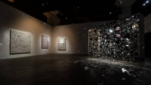
Artists can evoke emotions by creating sensory-rich environments. They combine color with light, sound, and motion to engage people and build connections. The most important component of multisensory art is light.
By strategically altering the color, intensity, and direction of light sources, architects can change the dynamics of the atmosphere and increase suspense.
Take Burj Khalifa for example; the interplay of colored lights on New Year builds viewers’ excitement and makes them pumped.
It is illuminated with vibrant colors such as bright gold, blue, green, red, and white to create a mesmerizing effect.
The use of warm and bright colors creates a vibrant and inviting ambiance. They also evoke feelings of warmth, celebration, and joy.
Furthermore, designers use pulsating lights, gradual color changes, and detailed patterns along with colors to create a sense of movement and rhythm.
They also synchronize everything with music to create a multi-sensory experience. Another advantage of changing lights is that it manipulates the perception of space.
Designers can use several techniques like spotlighting and backlighting to draw attention to specific elements and guide the viewer’s gaze.
They can also use it to alter the perceived scale and proportion of objects. With this theory in mind, architects place lights at different positions to cast shadows and exaggerate the height of buildings. Architects usually put lights on the ground to make buildings appear longer than it is.
Moreover, designers sometimes also illuminate the surroundings of a building like roads and trees to make it feel like the building covers a vast surface.
Another important component of sensory-engaging art is motion. Architects add complexity and energy to their work by using kinetic sculptures and fluid dynamics like flowing water.
Last but not least, sound also plays a crucial role in enhancing the experience. By integrating sound into the installation, artists can amplify the emotional impact of color.
For example, playing a soothing melody in a room that is decorated with cool colors can calm you down more effectively.
On the other hand, playing sounds of flowing water, rustling leaves, or chirping birds in a space colored with earthy tones like brown, green, and blue can captivate the imagination.
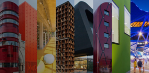
How Different Colors Can Be Used in Designs?
Designers leverage the effect of colors on human psychology to create powerful visual experiences and establish emotional connections with their audience.
Here is how different colors are used in design to create meaningful connections with the audience:
-
Red
Red is a warm and passionate color. It is often employed in marketing and packaging to grab attention and convey energy.
It’s associated with power and urgency, making it ideal for products and events seeking to evoke excitement or action.
-
Blue
Blue induces calmness, trust, and professionalism. It’s commonly used in office decor and by financial institutions to instill confidence and integrity.
Additionally, blue’s calming effect makes it suitable for healthcare environments and relaxation spaces.
-
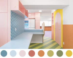
Pink
Pink is a versatile color that symbolizes compassion, empathy, and femininity.
Its lighter shades are used in healthcare settings to create a nurturing atmosphere while the darker shades are used in the fashion world due to their sophistication.
-
Purple
Purple is historically associated with royalty and it signifies luxury and spirituality. This is why it is used in luxury and ceremonial architecture to convey elegance and respect. Its softer shades evoke romance making it a popular choice of color for restaurants.
Moreover, purple is associated with innovation and progress which is why brands use it in their logos and interiors.