Blog post · June 2, 2026 · 7 min read
Fluted Ribs vs. Fractured Fins: Choosing the Right Linear Texture for Infrastructure Projects
Fluted ribs and fractured fins look similar on a spec sheet but perform very differently in the field. Here's how to choose the right linear texture for bridges, sound walls, and retaining walls.
Most architects treat the choice between fluted ribs and fractured fins as a visual preference. Pick the one that looks right in the rendering, add a liner spec, move on. That's the wrong way to think about it. The pattern you choose affects formwork pressure calculations, minimum concrete cover compliance, liner material selection, and whether the texture actually reads at the scale and speed at which the structure will be experienced. Get it wrong and you're looking at contractor RFIs, substitution requests, and a finished wall that doesn't match what you drew.
This is a specification decision. Treat it like one.
What Fluted Ribs Actually Look Like
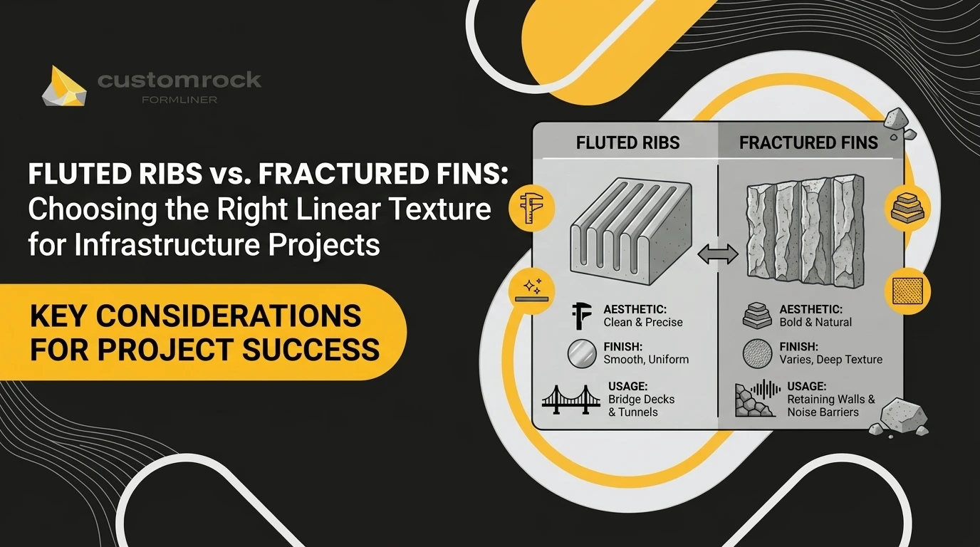
Fluted rib patterns are defined by uniform, parallel channels running continuously across the concrete face. The cross-section is typically V-shaped or U-shaped, with consistent width, depth, and spacing from one end of the panel to the other. There is no variation between adjacent ribs. The geometry is intentionally repetitive.
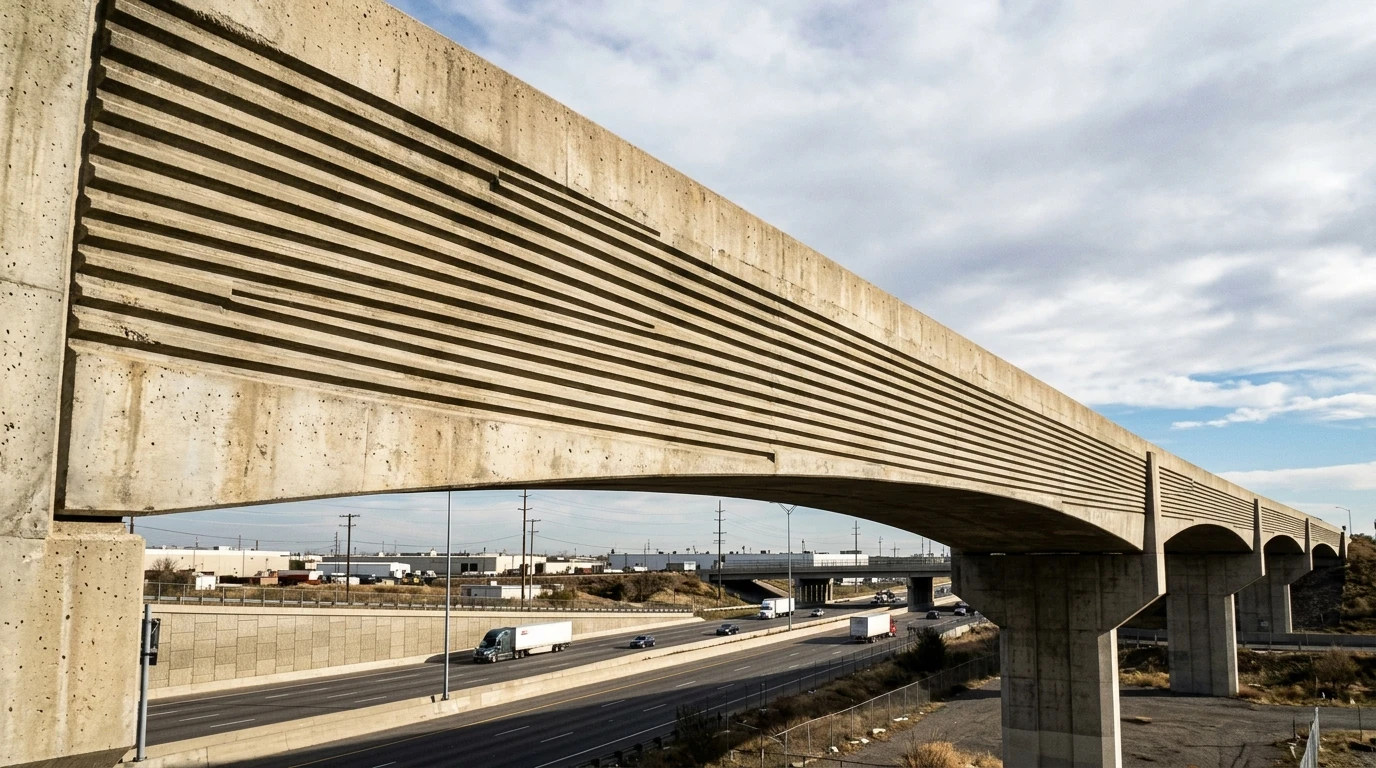
That regularity is the point. When raking light hits a fluted rib surface, it produces a predictable, high-contrast shadow line that repeats at a fixed interval. The effect is crisp and legible. At deeper rib profiles (1.5 inches and above), those shadow lines are bold enough to read clearly at highway speeds of 55 to 70 mph. At shallower profiles (0.5 to 0.75 inches), the texture registers as a subtle surface quality that rewards close inspection but disappears at distance.
The visual logic of fluted ribs is geometric and architectural. The pattern reinforces linearity and aligns with the structural logic of the objects it typically wraps: bridge fascias, sound walls, and retaining walls with strong horizontal or vertical datum lines.
What Fractured Fins Actually Look Like

Fractured fin patterns are the opposite of uniform. Each fin is a blade-like projection of irregular height and angle, mimicking the profile of split or cleaved stone. No two adjacent fins share the same profile. The surface reads as a field of variation, not a repeating unit.
The shadows fractured fins cast are non-repeating and shift dramatically with sun angle and time of day. At noon with high overhead light, the surface compresses and reads almost flat. At low morning or evening light, the fins throw long, irregular shadows that give the wall a deeply geological quality. That variability is what makes fractured fins work in naturalistic contexts. The surface feels like it belongs to the landscape rather than sitting in front of it.
Describing these two patterns precisely in a spec matters more than most architects realize. A spec that says "ribbed finish" or "fractured appearance" will generate an RFI. A spec that describes rib geometry (parallel V-channels, 1.5-inch depth, 3-inch on-center spacing) or fin geometry (irregular blade projections, variable height 1 to 2.5 inches, no repeating unit) gives the contractor something unambiguous to source against.
Matching Pattern to Application
The decision framework here isn't complicated, but it does require thinking about how the structure will actually be seen.
Bridge fascias and sound walls are infrastructure elements experienced primarily at highway speed. The viewer has a fraction of a second to register the surface. Fluted ribs with sufficient depth create a bold, legible rhythm that reads at that scale. The regular geometry also reinforces the linear form of the structure itself, so the pattern and the object work together. DOT aesthetic guidelines for bridge surfaces frequently reference ribbed textures for exactly this reason. A fractured fin pattern on a bridge fascia at highway speed reads as visual noise. The irregularity that makes fins beautiful at close range becomes illegible at 65 mph.
Retaining walls and abutments adjacent to natural terrain are a different problem. Here, the structure needs to recede, not announce itself. A large concrete plane with a uniform ribbed texture reads as institutional in a wooded or rocky context. Fractured fins break up the surface mass in a way that echoes natural rock formations. The irregular shadows reduce the "wall effect" that smooth or uniformly patterned concrete creates. The structure starts to look like it was excavated rather than built.
Viewing distance and context should drive the specification. Fluted ribs for structures read at speed or distance. Fractured fins for structures that need to integrate with the landscape at closer range.
The Structural Implications of Liner Depth
This is where the "aesthetic choice" framing breaks down. Liner depth has direct structural and code implications that need to be in the spec.
Deeper liners increase the effective lateral pressure at the form face. Fins or ribs exceeding 2 inches of projection require tighter form tie spacing and potentially thicker form panels to prevent blowout or deflection during the pour. This isn't a problem to solve in the field. It needs to be accounted for in the formwork design, which means the liner depth has to be specified clearly enough that the contractor can plan accordingly. Vague specs push that decision downstream, where it gets made under time pressure by someone who may not have the full design intent in front of them.
Minimum concrete cover is the other issue. Per ACI 318, cover to reinforcing steel is measured from the concrete surface. When a fractured fin projects 1.5 inches into the form cavity, the nominal cover must be calculated from the back of the liner projection, not the face of the form. If the fin depth isn't accounted for in the structural drawings, the actual cover at the deepest point of the texture may fall below the code minimum. This is a spec coordination issue, not a field issue. Catch it at design, not during inspection.
The FHWA Bridge Aesthetics Sourcebook addresses surface treatment considerations for bridge structures and is worth referencing when writing DOT-facing specs.
Liner Material Follows Pattern Geometry
The choice between plastic foam and urethane liners isn't purely a budget decision. Pattern geometry drives it.
Fractured fin profiles have irregular undercuts and fine surface detail that require the flexibility and dimensional stability urethane provides. Rigid plastic liners can crack under the stress of complex fin geometries and often fail to release cleanly from deep undercuts, damaging both the liner and the concrete face. For fractured fins, urethane is the correct material. The higher upfront cost is justified by clean release, longer liner life, and the detail fidelity the pattern requires.
Fluted rib patterns, with their simple parallel geometry and minimal undercut, are well-suited to plastic foam liners on budget-sensitive or single-pour applications. A temporary sound wall or a one-off retaining wall panel doesn't need a urethane liner. Plastic at a fraction of the cost produces a perfectly acceptable fluted rib surface.
For high-volume precast operations, urethane liners amortize well. A bridge project running 200 or more identical fascia panels can achieve up to approximately 100 reuses from a urethane liner set, which changes the cost math significantly compared to single-use alternatives. The PCI Architectural Precast Concrete Manual covers liner performance in precast applications in detail and is a useful reference for precast-specific spec language.
Customrock offers both plastic and urethane liners across its fluted rib and fractured fin pattern lines. If you're working with a pattern that isn't in the standard catalog, custom fabrication is available, including matching or replicating pattern numbers from other suppliers. That matters on DOT projects where a specified pattern needs to be sourced competitively without substitution.
Writing the Spec to Prevent Substitution
Contractor substitution requests on liner patterns are almost always a spec problem, not a contractor problem. If the spec doesn't give the contractor enough information to source the correct liner, they'll source the closest available option, and that option may be visually dissimilar.
For DOT projects and any project where surface texture is a design intent, the spec should include: the liner manufacturer's pattern number, liner material (plastic or urethane), nominal rib or fin depth, rib spacing or fin density, and joint or seam treatment. That level of specificity closes the substitution gap before it opens. It also gives the contractor a clear sourcing target, which reduces procurement friction and lead time questions.
Customrock's pattern numbers are specifiable directly, and the company can match or replicate patterns from other manufacturers when a project calls for a specific profile. Knowing that option exists is useful when a DOT spec references a pattern from a supplier with longer lead times or higher pricing. You can learn more about Customrock's history working with architects on infrastructure projects going back to 1971.
The Decision in Practice
If the structure is a bridge fascia or sound wall experienced at highway speed, specify fluted ribs at 1.5 inches or deeper, in a liner material matched to the pour volume. If the structure is a retaining wall or abutment in a naturalistic context, specify fractured fins in urethane, with liner depth and cover implications coordinated with the structural drawings.
Neither pattern is universally better. They solve different problems. The architect who understands that distinction writes a tighter spec, generates fewer RFIs, and produces infrastructure that looks intentional rather than incidental.
If you're early in the design process and haven't committed to a pattern yet, that's the right time to talk to a liner manufacturer. Pattern selection is easier to get right at schematic design than it is to fix after the forms are built.