Blog post · September 2, 2026 · 11 min read
Bridge Abutments and Piers: A Specifier's Guide to Concrete Texture Patterns
A structured guide for architects specifying concrete finish patterns on DOT bridge projects — covering surface type, pattern selection, relief limits, and submittal requirements for abutments, piers, and wingwalls.
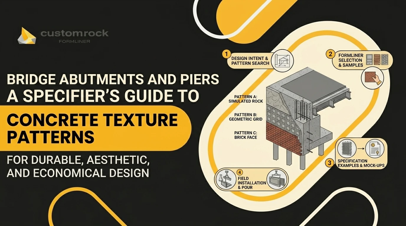
The finish schedule for a bridge substructure rarely gets the same attention as the superstructure above it. Abutments, piers, and wingwalls get a note that says "exposed architectural concrete" and a pattern number pulled from a previous project. Then the DOT reviewer sends it back, the contractor can't source the liner, and the pour date is already locked in.
That sequence is avoidable, but it requires treating bridge concrete texture patterns as a specification discipline rather than a late-stage aesthetic decision.
Why Form Liners Dominate DOT Bridge Aesthetics
Multiple state DOT bridge manuals now name form liners as the preferred architectural treatment for abutments, piers, and walls. Connecticut DOT's bridge manual is explicit: form liners are "the preferred method" and "a lower cost alternative to stone veneer." Colorado DOT goes further, prohibiting rock veneers on bridge substructures in favor of integral form-liner texture, specifically to prevent delamination and flying debris from freeze-thaw cycling, snowplow impact, and de-icing salts.
The physics are straightforward. A veneer system bonded to a concrete substrate is a second material with a different thermal expansion coefficient, a different moisture absorption rate, and an adhesion layer that degrades under repeated freeze-thaw cycles. An integral form-liner texture is the concrete surface itself. There is nothing to delaminate.
For architects, that distinction matters beyond durability. It means the masonry look on bridge infrastructure, coursed stone or fractured-fin patterns that read as solid material from the road, is achievable without the long-term liability of a bonded system. The texture is cast in. It stays.
Where to Spend the Texture Budget
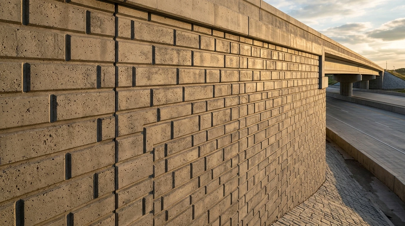
Not every surface on a bridge substructure earns a form liner. Wisconsin DOT makes this explicit: wingwalls are "the most visible portion of the abutment," and form liners on the abutment front face "provide no additional aesthetic value" unless pedestrians are present below the bridge. The reasoning comes down to viewing angle and distance. A driver approaching a grade separation sees the wingwall face obliquely and at eye level. The abutment front face, tucked under the deck, is rarely in the primary sightline.
A disciplined specifier concentrates the texture budget where the public actually sees the work:
- Wingwalls: High priority. These are the surfaces that read from the road, from adjacent sidewalks, and from the approach. Deep relief patterns, stone, fractured fins, fluted ribs, photograph well here and hold up visually at both close range and highway speed.
- Solid wall piers: High priority. A solid wall pier has the flat surface area that gives a pattern room to read. Coursing lines, shadow depth, and panel layout all work at this scale.
- Abutment front face: Low priority unless the bridge crosses a pedestrian path, a waterway with public access, or a lower roadway where the face is in direct view.
- Cap-and-column piers: Use with caution. Delaware DOT warns that form liners on cap-and-column piers "frequently appear out-of-place and unappealing." On a slender column, surface texture competes with structural form and usually loses. Taper, chamfer, and cross-section shape do more work on a column pier than any liner pattern.
This isn't a compromise, it's what the agencies recommend. Concentrating texture on wingwalls and wall piers produces a better result than spreading a thin budget across every exposed surface.
Pattern Categories by Surface Type
Vertical Wingwall and Abutment Faces
These surfaces get the most design attention for good reason. At typical highway viewing distances, patterns with 1.5 to 3 inches of relief read clearly and cast shadow lines that shift through the day. Stone patterns, ashlar coursing, random rubble profiles, work well here because the scale of the coursing can be calibrated to the mass of the wall. A wingwall that is 12 feet tall and 30 feet long reads differently than a retaining wall panel, and the pattern pitch should reflect that.
Fluted rib and fractured fin patterns are strong alternatives when the project context calls for something more abstract or contemporary. The difference between fluted ribs and fractured fins is worth understanding before specifying: ribs are regular and geometric, fins are irregular and suggest a broken or cleaved surface. Both cast strong shadow lines on a vertical face, and both hold up under freeze-thaw conditions because the geometry is simple and there are no thin projecting elements that can spall.
Brick patterns are less common on bridge substructures than on building facades, but they appear on projects where the bridge sits adjacent to a historic masonry district or a brick-heavy streetscape. When specified, New York DOT requires that stone or brick imitation patterns "appear natural," with attention to corners, top-of-wall termination, and avoidance of continuous seams in random patterns. That requirement is a design note as much as a submittal note: the pattern has to be specified with enough coursing variation that it doesn't tile visibly.
Sloped Wingwall Faces
Sloped surfaces introduce a coursing problem that flat surfaces don't have. Run a horizontal stone or brick pattern across a sloped wingwall and the coursing lines will read as tilted rather than level, which looks wrong even when it's geometrically correct. Wisconsin DOT's standard details address this directly: on sloped faces, adjacent form liner portions must be spaced so the coursing appears visually correct, which often means adjusting the liner layout to compensate for the slope angle.
For sloped wingwalls, linear patterns, fluted ribs or fractured fins running perpendicular to the slope, often read more cleanly than horizontal coursing patterns. The lines follow the geometry of the surface rather than fighting it. If a stone or brick pattern is required for context reasons, the submittal package should include a scaled elevation showing how the coursing terminates at the top and bottom of the slope.
Traffic-Facing Barrier Surfaces
New York DOT is explicit on this point: traffic-facing barrier faces require a "smooth continuous surface" to prevent vehicle snagging. Texture is prohibited on that face. The outside face of the barrier, the pedestrian or landscape side, can receive a form-liner treatment. This distinction needs to be called out clearly in the finish schedule, because a contractor reading a general "architectural concrete" note may apply texture to all faces.
Plastic vs. Urethane on Bridge Projects

The choice between plastic foam and urethane foam liners on bridge work is not just a quality or reuse decision. Caltrans frames it as a schedule tool: urethane (elastomeric) liners "allow minor corrections to be made at the job site before installation, without needing a remake, thereby delaying the scheduled concrete pour." On DOT bridge projects with construction milestone dates and penalty clauses, that flexibility has real value.
Urethane liners also hold tighter detail at depth, which matters for stone and fractured-fin patterns where the shadow line is doing most of the visual work. For a wingwall that will be in public view for 50 years, the per-sheet cost difference between plastic and urethane is not the right unit of comparison. The right comparison is total cost against total reuse count and the risk of a pour that doesn't meet the finish schedule.
For projects where the liner will be used once, a single abutment pour on a rural bridge replacement, plastic foam is a reasonable choice if the pattern is relatively simple and the relief is shallow. For anything with deep relief, complex coursing, or multiple pours across a construction season, urethane is the more defensible specification. The plastic vs. urethane decision framework applies here the same way it does on building facades, with the added weight of DOT schedule constraints.
The 4-Inch Relief Limit
Iowa DOT sets a maximum of 4 inches of unreinforced concrete relief on articulated pier surfaces, and limits projected surface area for deeper textures to approximately 50% of the total face. This is a structural and durability constraint, not a stylistic guideline. Fractured fins, deep stone profiles, and aggressive fluted rib patterns all need to be evaluated against this limit before the pattern is specified.
The practical implication: patterns with 3 to 4 inches of relief need to be detailed so that the projected area stays within the 50% threshold. That usually means adjusting the spacing between elements rather than reducing the depth of individual elements. A pattern that reads as deep and dramatic in a sample panel can exceed the projected-area limit when applied across a full pier face. Confirm the geometry with the liner manufacturer before the submittal.
DOT Submittal Requirements
Iowa DOT requires at least three pre-approved liner manufacturers and pattern numbers in contract documents, no sole-source specifications. This is standard practice across multiple states and reflects procurement law as much as design intent. For architects, it means specifying by pattern category and performance criteria rather than a single proprietary number.
The specification should describe: pattern type (stone, rib, fin, brick), minimum relief depth, maximum relief depth, coursing pitch, and acceptable color range for the concrete mix. That description allows an agency to pre-qualify equivalent patterns from multiple suppliers, including those who can match or replicate a specified pattern when the original isn't available through the contract's approved supplier list.
Colorado DOT caps aesthetic treatments, including form liners, color, and rustications, at less than 5% of individual project cost and 2% at the statewide program level unless outside funding is provided. That cap applies to the total aesthetic package, not just the liner cost. It's worth confirming early in schematic design whether the texture scope fits within that threshold, before the finish schedule is fully developed.
Iowa DOT also notes that design continuity between pier and abutment wing surface treatments "typically yields visual success." A wingwall in random ashlar and a pier in fluted ribs on the same bridge will read as two unrelated decisions. The texture theme should be consistent across substructure elements, even if the pattern depth or scale varies by surface type.
A Practical Checklist for Specifying Concrete Texture on DOT Bridge Projects
Before the finish schedule is finalized and the submittal package goes to the agency:
Surface selection
- Identify which surfaces are in the primary public sightline (typically wingwalls and solid wall piers)
- Confirm whether abutment front faces have pedestrian viewers; if not, consider smooth or lightly textured concrete
- Flag all traffic-facing barrier surfaces for smooth finish per NYSDOT and similar requirements
- Evaluate cap-and-column piers for whether shape and chamfer alone are sufficient
Pattern specification
- Specify by pattern category and dimensional criteria, not sole-source product number
- Confirm maximum relief depth against the applicable DOT limit (Iowa DOT: 4-inch max on pier surfaces)
- Check projected surface area for deep-relief patterns against the 50% threshold
- Address coursing compensation on sloped wingwall faces in the specification notes
- Require that stone and brick patterns avoid continuous seams and include corner and termination details
Liner type
- Specify urethane liners for any pour with multiple reuses, deep relief, or tight schedule constraints
- Specify plastic liners only for single-use, shallow-relief applications where schedule flexibility exists
Submittal requirements
- List at least three pre-approved manufacturers and equivalent pattern numbers
- Require a full-scale mock-up panel (minimum 4 feet by 4 feet) before the production pour
- Confirm the mock-up includes the proposed concrete mix, color, and finish treatment
- Require coursing alignment drawings for sloped surfaces
- Confirm fillet and edge detailing at abutment noses and pier edges, Oklahoma DOT requires 3/4-inch triangular fillets at all concrete edges to prevent finish damage at form removal
Budget
- Confirm total aesthetic treatment cost against the applicable DOT cap (CDOT: less than 5% of project cost)
- Evaluate liner cost against reuse count and schedule risk, not per-sheet price alone
The broader pattern selection principles that apply to building facades carry over to bridge work, with the added layer of DOT structural constraints and multi-manufacturer submittal requirements. Getting those constraints into the specification early, before the formwork is designed and the pour schedule is set, is the difference between a bridge substructure that reads as designed and one that reads as an afterthought.
FAQ
Which bridge surfaces should receive form liner patterns?
Wingwalls and solid wall piers are the highest priority. These are the surfaces in the primary public sightline from the road and from adjacent pedestrian areas. Abutment front faces typically don't warrant form liners unless pedestrians are present below the bridge. Traffic-facing barrier surfaces require a smooth finish for vehicle safety. Cap-and-column piers are often better articulated through shape and chamfer than through surface texture.
What is the maximum relief depth allowed on bridge pier surfaces?
Iowa DOT sets a 4-inch maximum for unreinforced concrete relief on articulated pier surfaces, with projected surface area for deeper textures limited to approximately 50% of the total face. Other states have similar constraints. Confirm the applicable limit with the relevant DOT before finalizing the pattern specification, and verify the geometry with the liner manufacturer before the submittal.
Why do DOT bridge manuals prefer form liners over stone veneer?
Bonded stone or brick veneer is a long-term liability on bridge substructures. Colorado DOT prohibits rock veneers specifically to prevent delamination and flying debris under freeze-thaw cycling, snowplow impact, and de-icing salt exposure. An integral form-liner texture is the concrete surface itself, there is no adhesion layer to degrade. Multiple state DOTs now name form liners as the preferred and lower-cost alternative to veneer systems.
Should I specify plastic or urethane form liners for bridge work?
Urethane liners are the better choice for most bridge applications. They hold tighter detail at depth, allow job-site corrections before installation without requiring a full remake, and support multiple reuses across a construction season. Plastic foam liners are appropriate for single-use, shallow-relief pours where schedule flexibility exists. On DOT projects with milestone dates and penalty clauses, the schedule advantage of urethane is worth more than the per-sheet cost difference.
How do I handle coursing on sloped wingwall faces?
Horizontal coursing patterns on a sloped surface will read as tilted rather than level, which looks wrong even when geometrically correct. Wisconsin DOT's standard details require that adjacent form liner portions on sloped faces be spaced so coursing appears visually correct. Linear patterns, fluted ribs or fractured fins running perpendicular to the slope, often read more cleanly than horizontal coursing on sloped wingwalls. If a stone or brick pattern is required, include a scaled elevation showing coursing termination in the submittal package.
What are the DOT submittal requirements for form liner patterns on bridge projects?
Iowa DOT requires at least three pre-approved liner manufacturers and equivalent pattern numbers in contract documents, no sole-source specifications. Most DOTs require a full-scale mock-up panel before the production pour. The specification should describe pattern type, minimum and maximum relief depth, coursing pitch, and acceptable concrete mix and color range. Colorado DOT caps total aesthetic treatment cost at less than 5% of individual project cost, so confirm the texture scope fits within that threshold early in design.